

UX Design Internship
Purdue Owl and Writing Lab
Redesigned the Purdue OWL and Writing Lab website to improve usability and interactivity. Focused on updating the navigation of over a thousand pages and creating unique templates which can be used as the site continues to grow.
Project Overview
The focus for the summer internship was redesigning the whole Purdue Owl site by creating more intuitive WL and OWL navigation and developing new page templates to establish consistency.
For the WL, we aimed to create page-specific designs, but given the OWL’s quantity of content, we chose to create general page templates that could be changed for different needs based on the content. For both sites, we planned not only to create a cohesive site design, but also suggest redesigns of their navigation and deliver any analysis we conducted on both sites.
-
The Purdue Online Writing Lab (OWL) is a globally renowned institution which provides writing assistance to students, professionals, and organizations across the world.
Under the name Purdue OWL, there is the OWL and the Writing Lab. The OWL houses numerous online resources so people around the world can find information to assist with any writing projects, while the Writing Lab is focused on providing writing services specifically to Purdue Students.
-
During the semester project I was a Co-lead. As it was my first time leading a project I worked tirelessly to create daily class schedules and activities, assign tasks, and check work.
During the summer internship, I participated in a variety of roles from spearheading research to developing hi-fis to completing final iterations.
-
Figma, Miro, KardSort, UXTweak
-
Sponsored Class Project: January 2021 - May 2021
Summer Internship: May 2021 - August 2021

Interviews
We interviewed 3 different groups: Faculty, Students, and Tutors. Our Goal was to gauge how the awareness and usage of the WL and OWL sites vary among stakeholders and understand the degree to which these resources are meeting their needs. We were able to interview 24 people across these groups.
-
We talked to two college students, seven Purdue undergrads, and one Purdue grad student about their experiences using the Writing Lab and OWL sites. We created questions that would lead to discussion about the content and its structure on the site, resources they commonly use, and their reasoning and frequency when using the site.
Takeaways
Due to students feeling uncomfortable asking for help, they are more likely to be recommended to the OWL from professors rather than seeking advice themselves. We also found that Students generally don’t use the in-site navigation, which leads to high bounce rates and less exploration of the site.
66.67% want an informational article to have recommendations for where to find information next
50% struggle to navigate the WL and blindly guessed when asked to find specific content
-
When interviewing Purdue Faculty members we had three main goals:
Understand their current interactions with the site
Identify ways that the resources provided by OWL are beneficial to them
Learn about the perceived impact the OWL has on their students’ writing
Takeaways
Although faculty members want to recommend useful resources to their students, they tend to have poor knowledge of the Writing Lab’s resources.
Awareness of Resources
87.5% visit the OWL
37.5% are familiar with workshops
62.5% have never used OWL presentations
Recommendations to Students
50% find specific resources to refer to students
25% send students to WL workshops
50% will cater recommendations depending class curriculum
-
Due to the unique perspective of WL Tutors, we conducted six interviews to learn more about their thoughts on the OWL. Our goal was to learn their perceived usefulness of the Writing Lab’s resources and their perception of other students use of the OWL resources.
Takeaways
Tutors often have to help students locate the information they are looking for on the sites as it is difficult to navigate. The development and implementation of a simplified, intuitive navigation would assist them in ability to help their clients.
Opinion on WL & OWL Navigation
50% view WL and OWL navigation as confusing
16.7% like the current navigation
33.3% use google to navigate the sites
Awareness of WL Resources
83.3% believe WL events are poorly promoted
33.3% don’t pay attention to workshop events
33.3% have never considered attending a tutoring session themselves

Site Map
The team created an OWL site map to understand its content and observe how pages were connected to each other. Our team outlined the OWL's navigation on Miro using sticky notes to represent each tab and sub-tab. We then went through each page of the website and added any internal connections within the site using red lines. Although strenuous, completing this site map created a foundation and launching point for the team to move forward.
Takeaways
Overall inconsistent formatting on pages
Some pages were frequently linked to for not apparent reason
Pages contained broken links, led to non-existent pages
Pages contained outdated content
By identifying the takeaways listed above, we were able to determine which pages had errors that needed to be fixed and pages that could possibly be condensed, combined, or removed.

Understanding Navigation
Understanding Navigation
To understand what information hierarchy is most intuitive to those who use the OWL, we conducted a Card Sort using 50 pages from the OWL.
Seven participants, across our 3 user groups, were tasked with moving each page into categories they created.
To gain insights on the current navigation when compared to our proposed WL navigation, we conducted a Tree Test.
We wanted to know the ways in which our new navigation addressed points of confusion with the current site navigation and identify further areas for improvement.
Participants are were given a task and could only use the navigation bar to select where they believed the information was located.


Navigation Testing
After creating four different navigation designs, we tested them with users to see which was most appealing. We also wanted to identify the aspects of each designs that were well liked and frustrating.
The four designs were divided into two groups based on similarity. We created a testing protocol that required our five participants to look at the designs in each pair individually and then choose their favorite design from the pair. Next, participants would choose their top design from the winners of the previous pairs.
Finally, participants were asked to rank all four designs and provide reasoning for their rankings. During this process we asked them questions to uncover their thoughts on the design elements and what aspects grabbed their attention first.
Final Designs
Below is a slideshow showing all the final designs the team created for the OWL and WL sites along with the current pages. To interact with the Hi-Fi Writing Lab prototype, please click the button to the right. This prototype was developed by the team and contains over 300 connections. We used this prototype to test with our users and updated it according to any problems we found.
P.S. In order to have the most seamless experience navigating this prototype, click the “Options” drop down menu on the top right of the screen and select “Width - scale down to fit width”

Purdue Owl Homepage
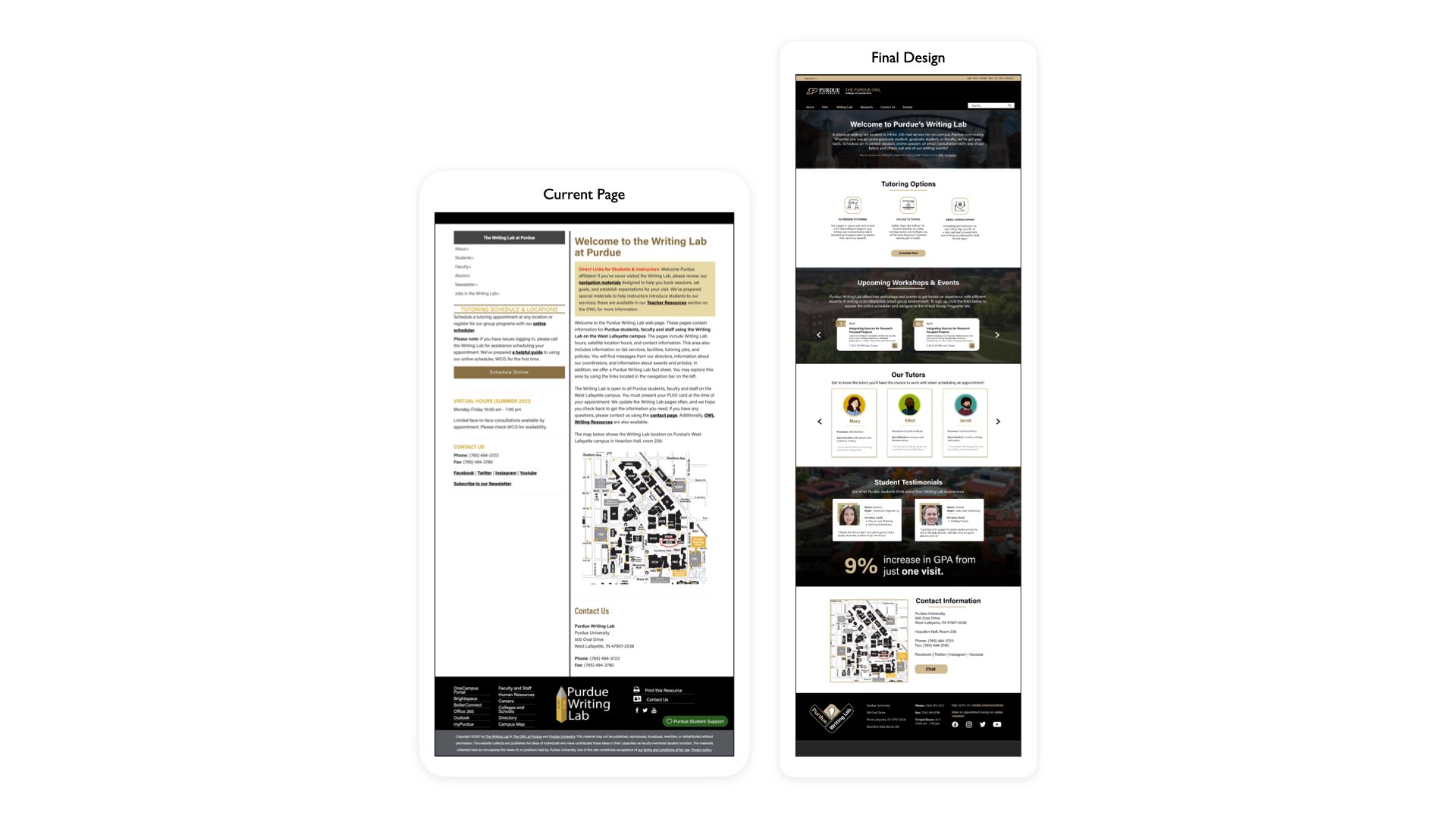
Writing Lab Homepage

WL Landing Pages
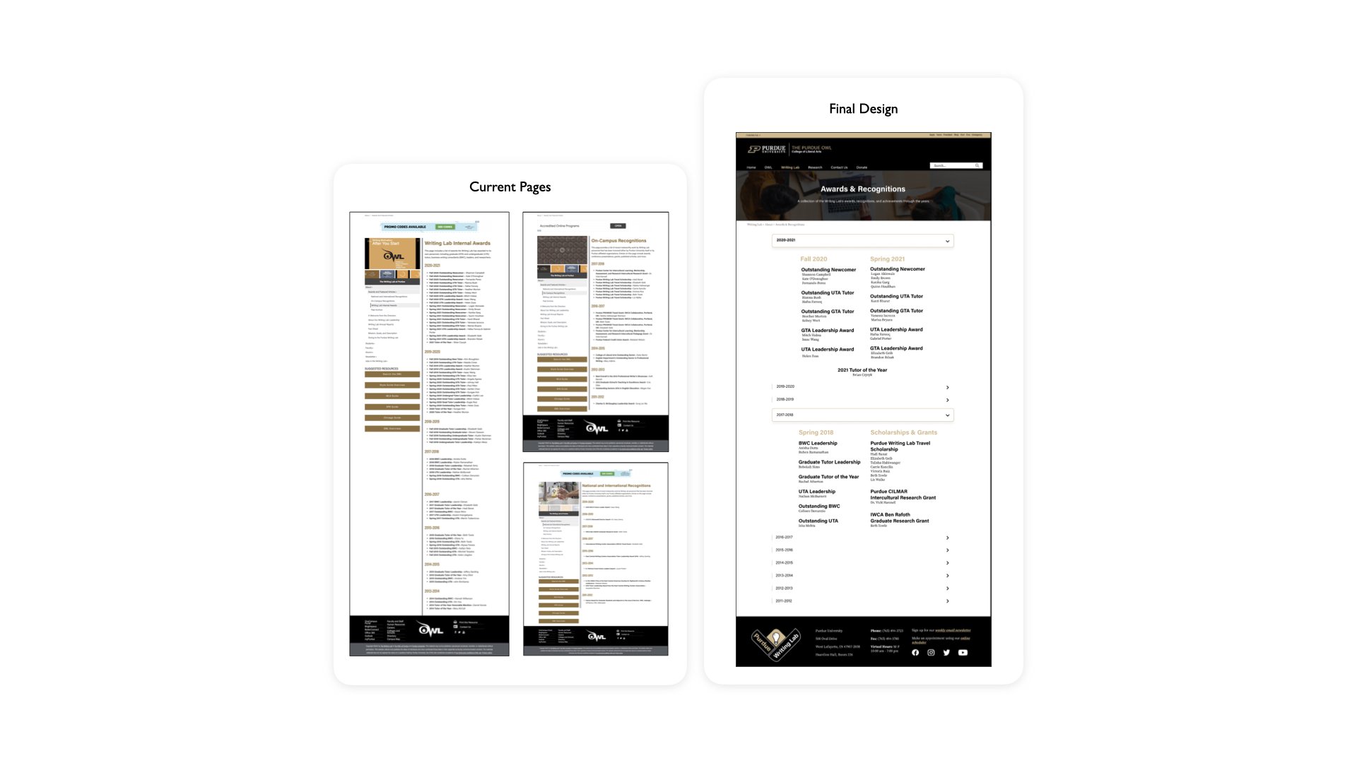
WL Awards & Recognition Page
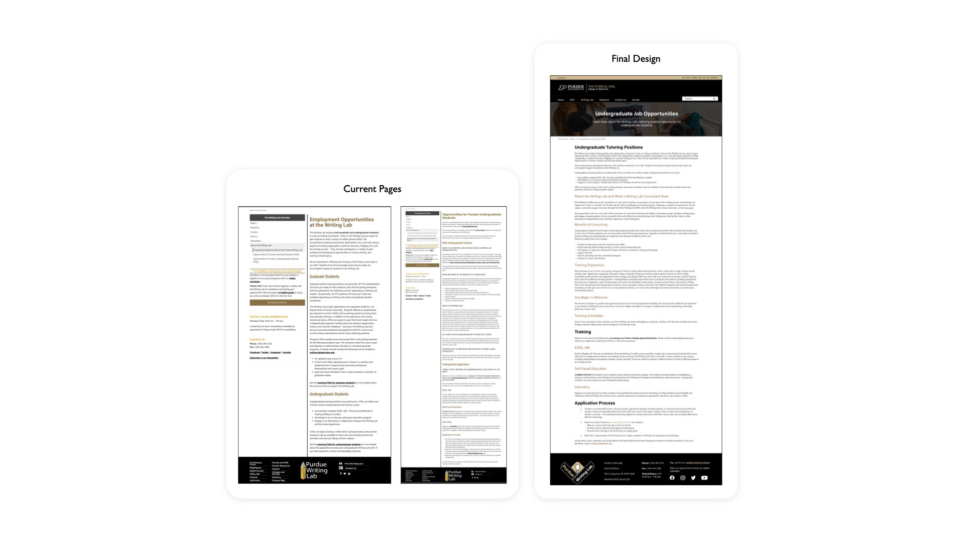
WL Undergraduate Job Opportunities
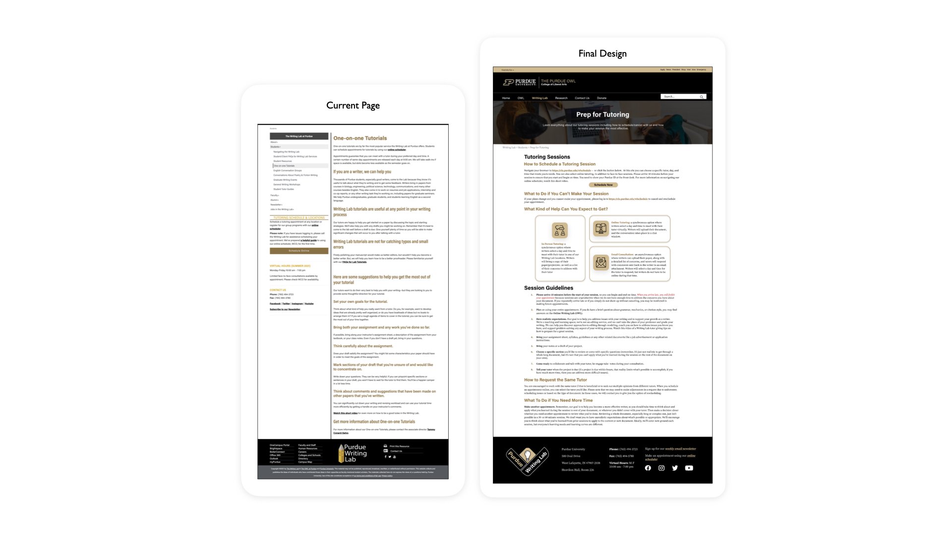
WL Tutoring Page
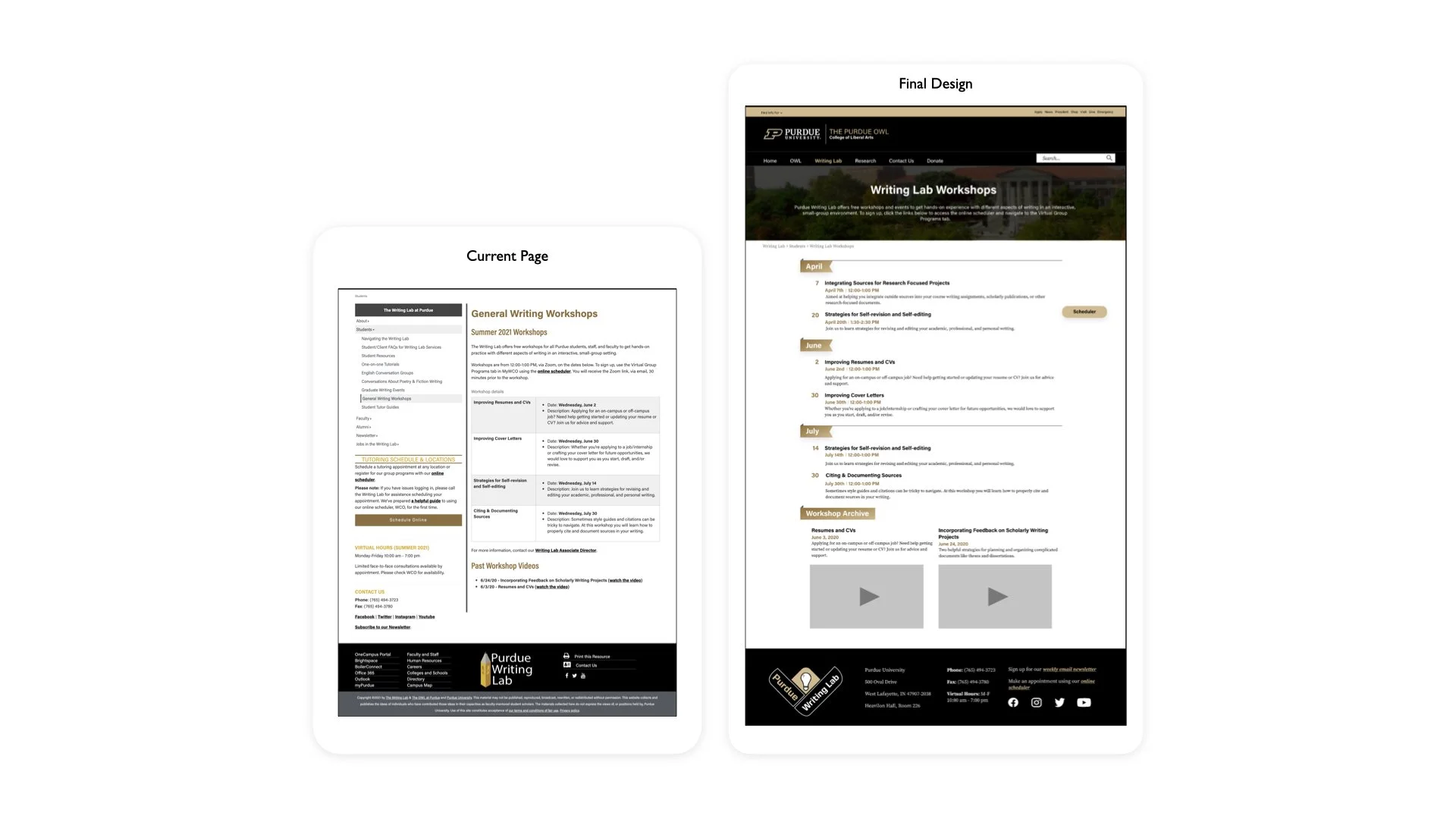
WL Workshops Page
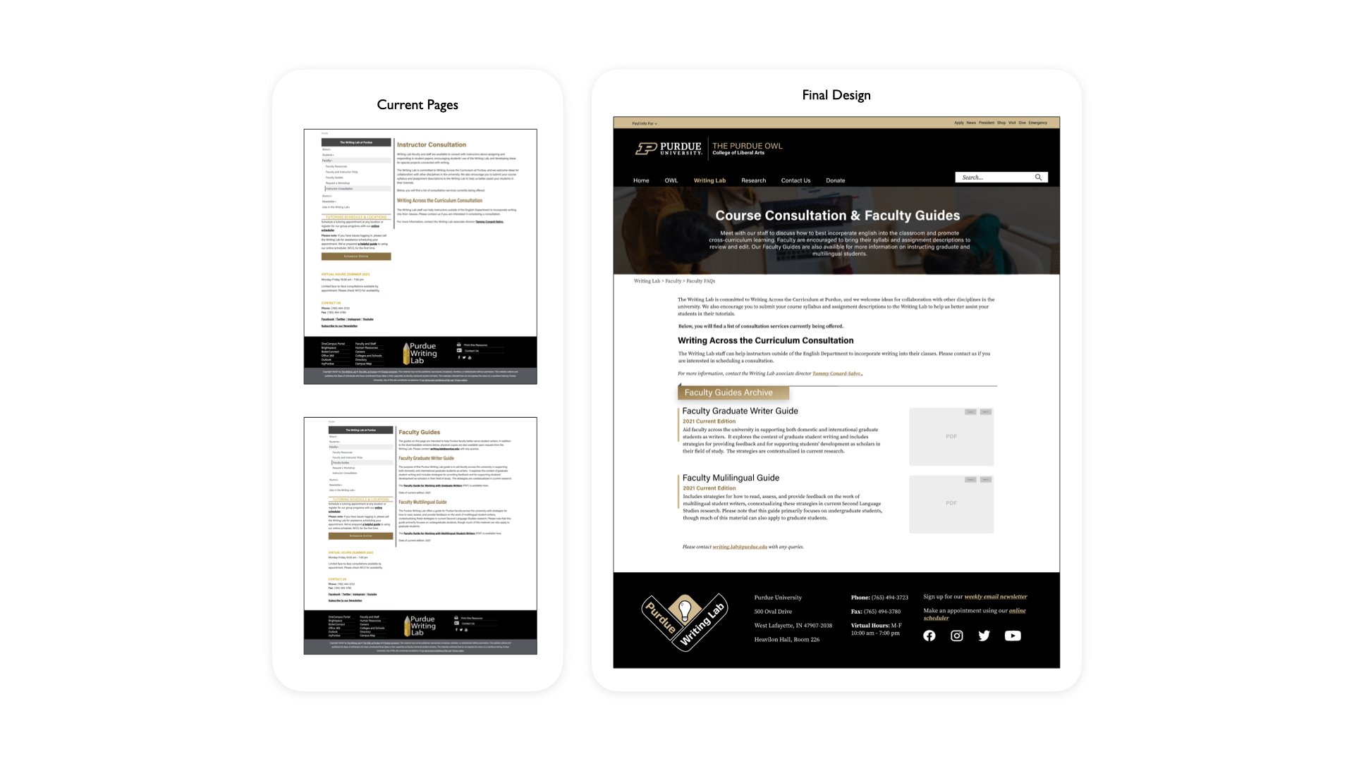
WL Course Consultations & Faculty Guides
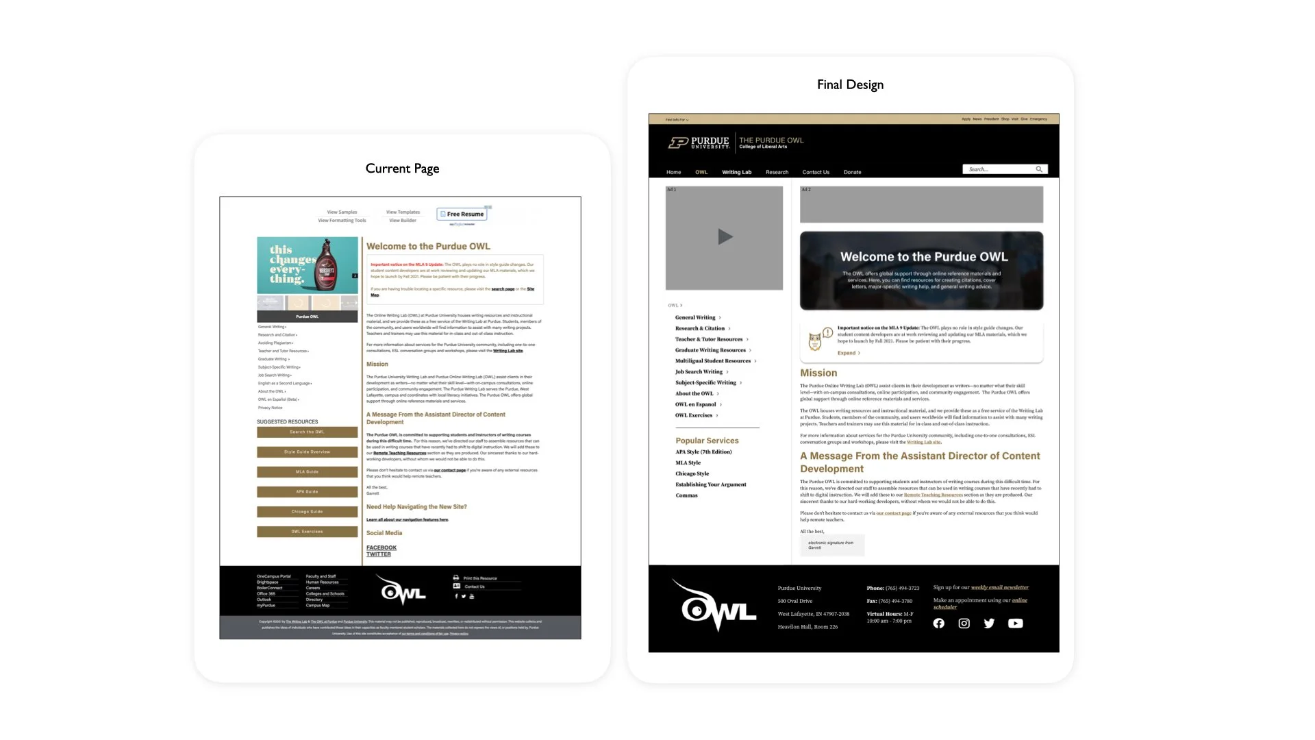
OWL Homepage

OWL Landing Page Template
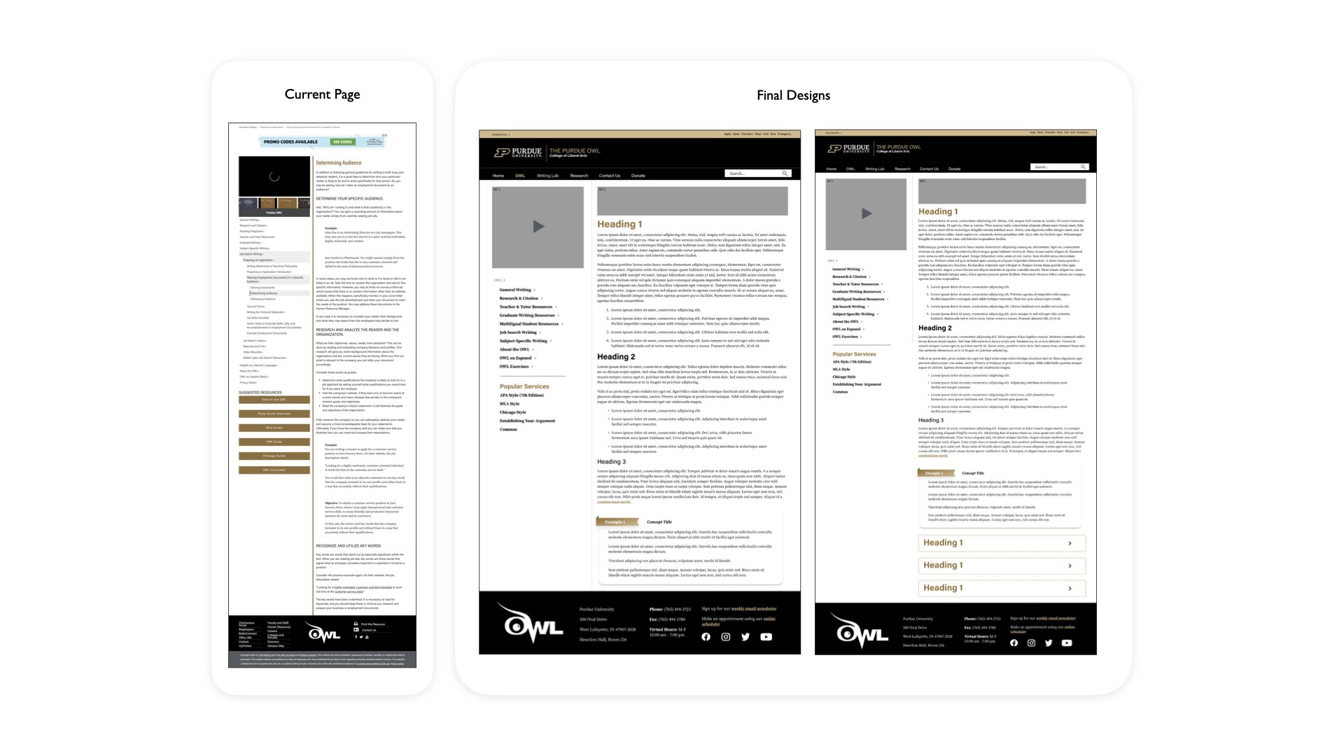
OWL Article Page Template

OWL Dropdown Menu Template
Final Thoughts
Leading this project provided me with invaluable opportunities to enhance my UI skills and grasp the significance of various criteria such as heuristics and content hierarchy.
Working alongside team members of varying skill levels offered me valuable insights into effective teamwork, facilitating my growth as a team player. Despite our meetings being confined to Zoom due to the COVID-19 Pandemic, throughout the semester and summer, we efficiently accomplished our tasks and forged strong bonds as a cohesive group.